The Democratisation of Icons
It’s May 17, 2026:
yesterday, the Royal Pop was launched—a €400 watch featuring the Audemars Piguet logo and the design codes of the Royal Oak.
A watch designed to let anyone wear a timepiece that exudes the essence of AP and the Royal Oak.
Fast rewind: the year is 1993:
the quartz crisis was (almost) forgotten, and the watch industry was in an exciting phase of rebuilding.
Panerai began “free sales” of its watches, Lange und Söhne was in the midst of preparing for its spectacular rebirth, and Glashütte Original was still deep in crisis.
Audemars Piguet ventured into the Royal Oak Offshore, and Omega released early versions of the modern Seamaster Professional 300M, which later became world-famous thanks to James Bond.
For watch enthusiasts who lived through this era, the launch of IWC’s “Il Destriero Scafusia”—at the time one of the most complicated wristwatches in the world—is likely the most memorable event from that period.
Who knew “BUNZ” back then?
Even though the company from Pforzheim/Germany had already been in business for nearly 20 years and its founder was known as the “Platinum King.” A company whose platinum and diamond creations were worn by celebrities like Catherine Deneuve?
And even though Georg Bunz was already active as a watch designer in the 1980s:
the “Diamondtime” had a platinum case and—patented and unheard of!—a diamond in the sapphire crystal!
Then, in 1993, came a small sensation that wasn’t really recognised as such at the time:
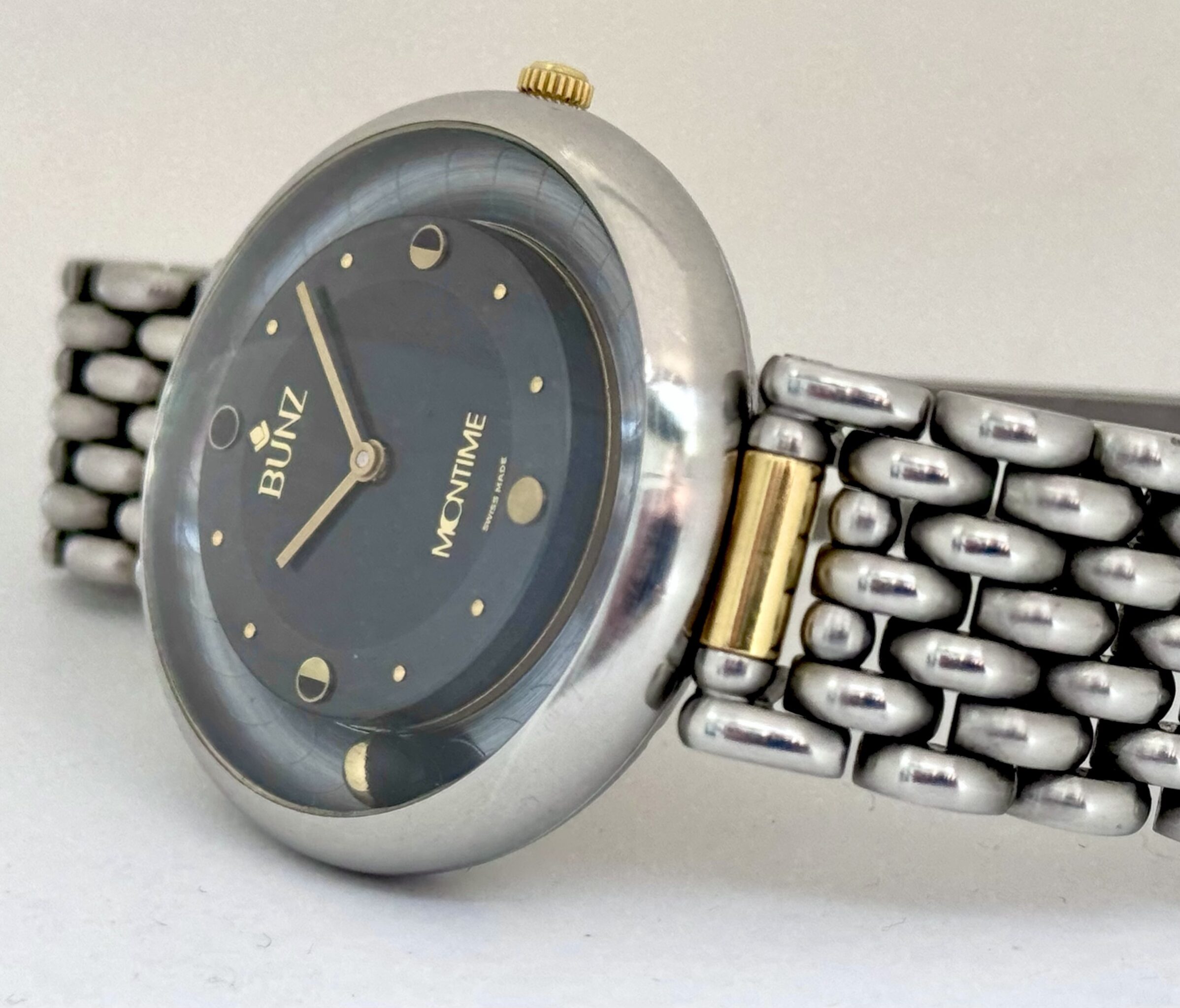
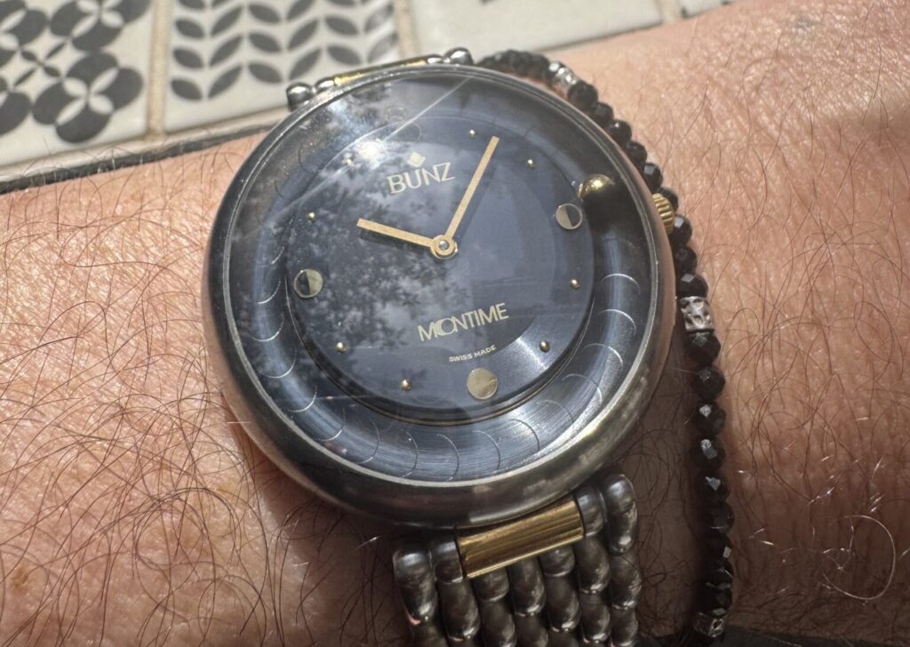
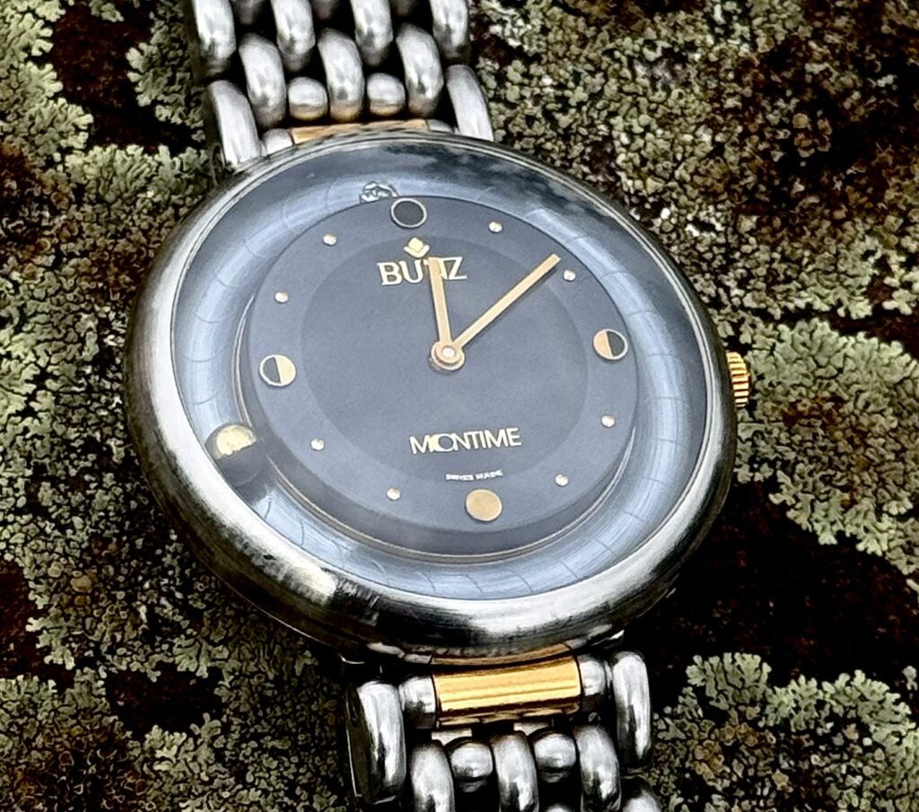
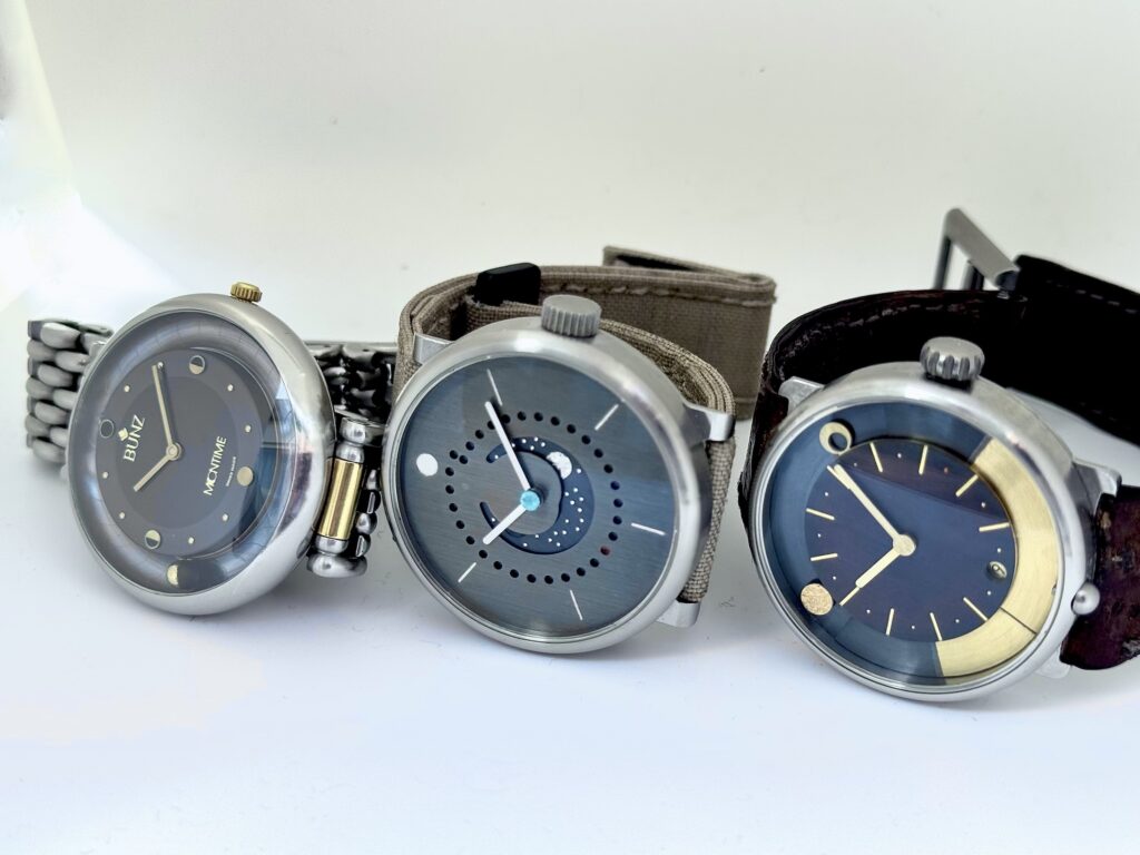
the Bunz “Moontime” was released (which would later be called Moontime 1 to distinguish it from other models—quartz, different case shapes, etc.).
In terms of design, it was a child of the ’90s: unusual lugs, a pebble-like case, two-tone—and with a diamond at the 12 o’clock position!
But that wasn’t the sensation.
Rather, it was the first watch (long before, for example, de Bethune launched the DB15 in 2004) with a spherical (i.e., round) moon phase display.
The moon is half gold and half black and rotates around its own axis and around the dial in such a way that the gold side always faces the sun—namely, the diamond at 12 o’clock.
This allows the moon phase to be read in two ways: by the moon sphere itself and by its position relative to the dial:
if the moon is at 12 o’clock, it is a new moon (and the black side is facing up); if it is at 6 o’clock, it is a full moon (and the golden side is facing us).
And there’s more: while back then—as is still the case today—most moon phase complications were based on 59-tooth discs, the Moontime’s design was far superior:
with a deviation of just one day after 120 years (instead of nearly three as is customary), it was likely also the most accurate moon phase display of its time.
How did Bunz achieve this?
Well, by the time of his collaboration with Ulysse Nardin and the development of groundbreaking watches there (the third and final model of the “Trilogy of Time”—three astronomical wristwatches that were unique in the truest sense of the word—was released in 1992), Dr. Ludwig Oechslin was world-renowned in the industry.
And he was, in fact, the designer of the “Moontime”!
Even though the Bunz Moontime was certainly not cheap, compared to Ulysse Nardin, it was an affordable way to get an astronomical complication by Ludwig Oechslin … so to speak … a democratisation of icons …
Pros
– The moon is simply… heavenly
– Historically significant model
– Great bracelet
Cons
– Any repairs to the moon phase mechanism are likely to be expensive
– The glass is domed and not anti-reflective => making it nearly impossible to photograph
– 1990s design
Quality
90
Style
75
Value
90
Wearability
80
Leave a Reply
You must be logged in to post a comment.